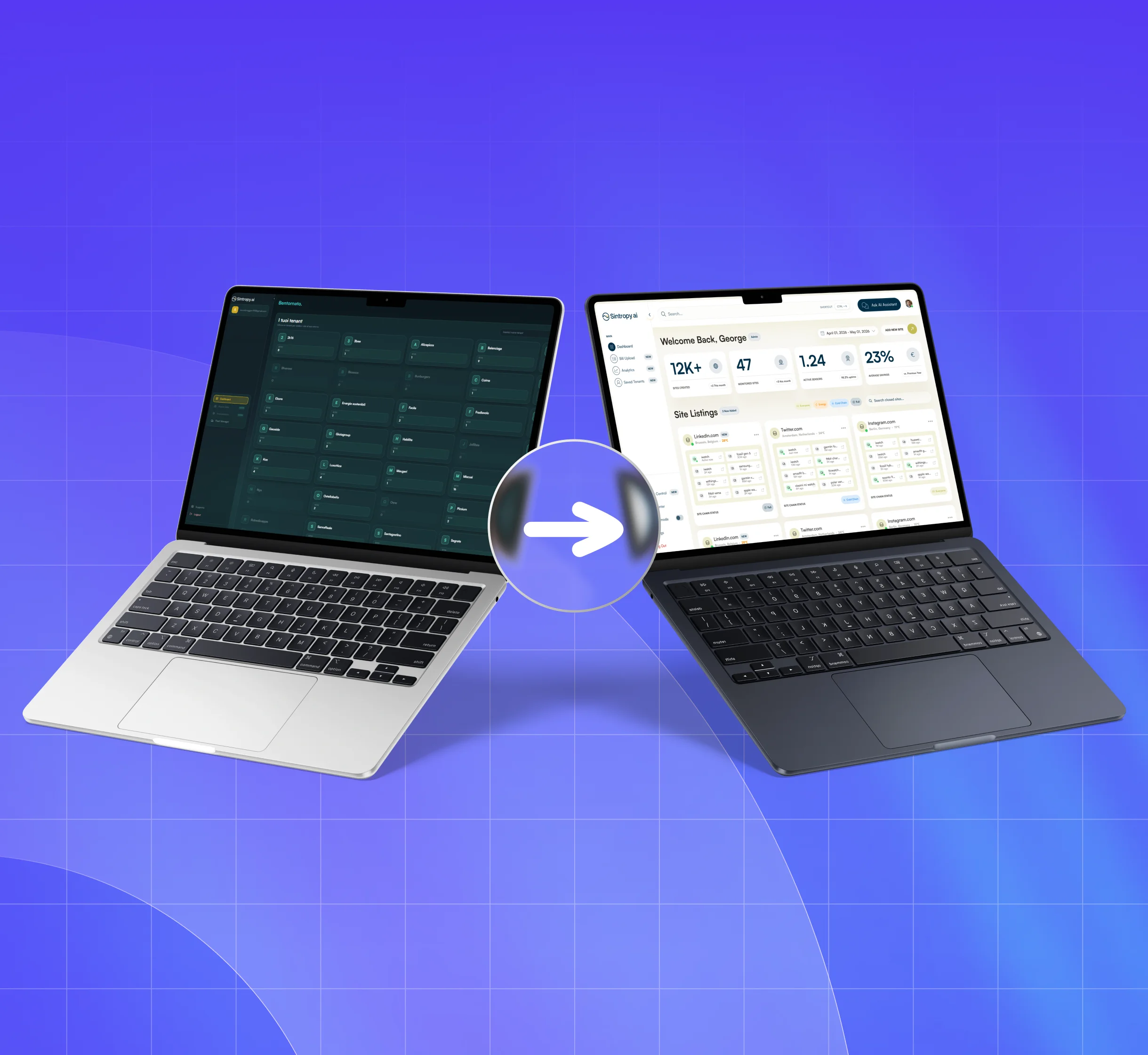
Rethinking a platform already in use
The operations platform was already in use by the Sintropy team to manage activities and data across multiple locations. It did the job, but had several usability issues: information was spread across complex interfaces, utility screens, and disconnected workflows. This made it harder for users to quickly understand what was happening and where attention was needed.
The work started with the dashboard, addressing these issues to make the experience clearer, more consistent, and easier to use.
A dashboard that shows what is happening
The dashboard brings key information such as activity, status, and savings indicators into view, so users can understand what is going on without searching across separate screens.
From a tenant list to a workspace
Tenant management evolved from a simple directory into a structured overview of sites, activity, status, location, and key information. The interface also distinguishes the needs of people managing the portfolio from those working with individual tenants and sites.
A consistent experience across screens
I helped make the different areas of the platform more consistent through clearer visual hierarchy and a shared language for typography, cards, states, filters, navigation, and data visualization.
From design to frontend development
Starting from the design, I built the frontend pages in React. I integrated authentication through Amazon Cognito and connected the interface to the existing backend APIs; I did not build the backend.
The result
Sintropy’s operations platform now offers a clearer, more consistent experience, with better-connected information and workflows that help users find their way around and take action more easily.
